Perrone
Having worked with Perrone for many years as one of our suppliers of premium leather and textiles for major commercial airlines and rail interior projects, they had an understanding of the different design services provided by PriestmanGoode. So we were delighted to be invited by Perrone to review and update their brand identity.
Challenge
With over 100 years of experience, Perrone is well established as supplier-manufacturer of performance leather and textiles for the transportation industry. They also have an important message and role to play as focus shifts towards natural, lightweight and durable materials that contribute towards net zero targets in aviation. The brief received by our Branding + Graphics team requested a more cohesive look for the brand and unification of the identity to represent all their expanding services such as customisation and maintenance.
Solution
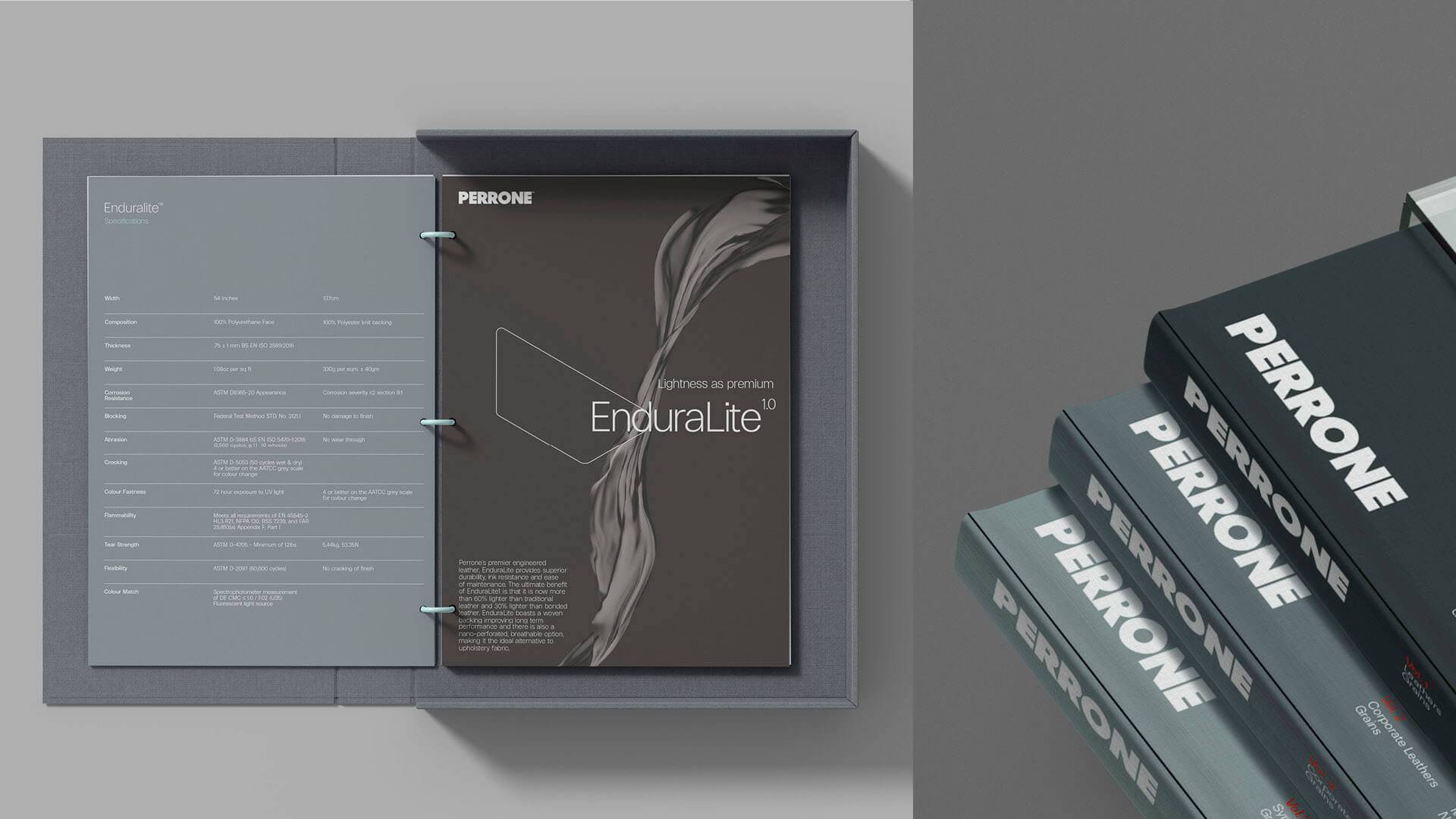
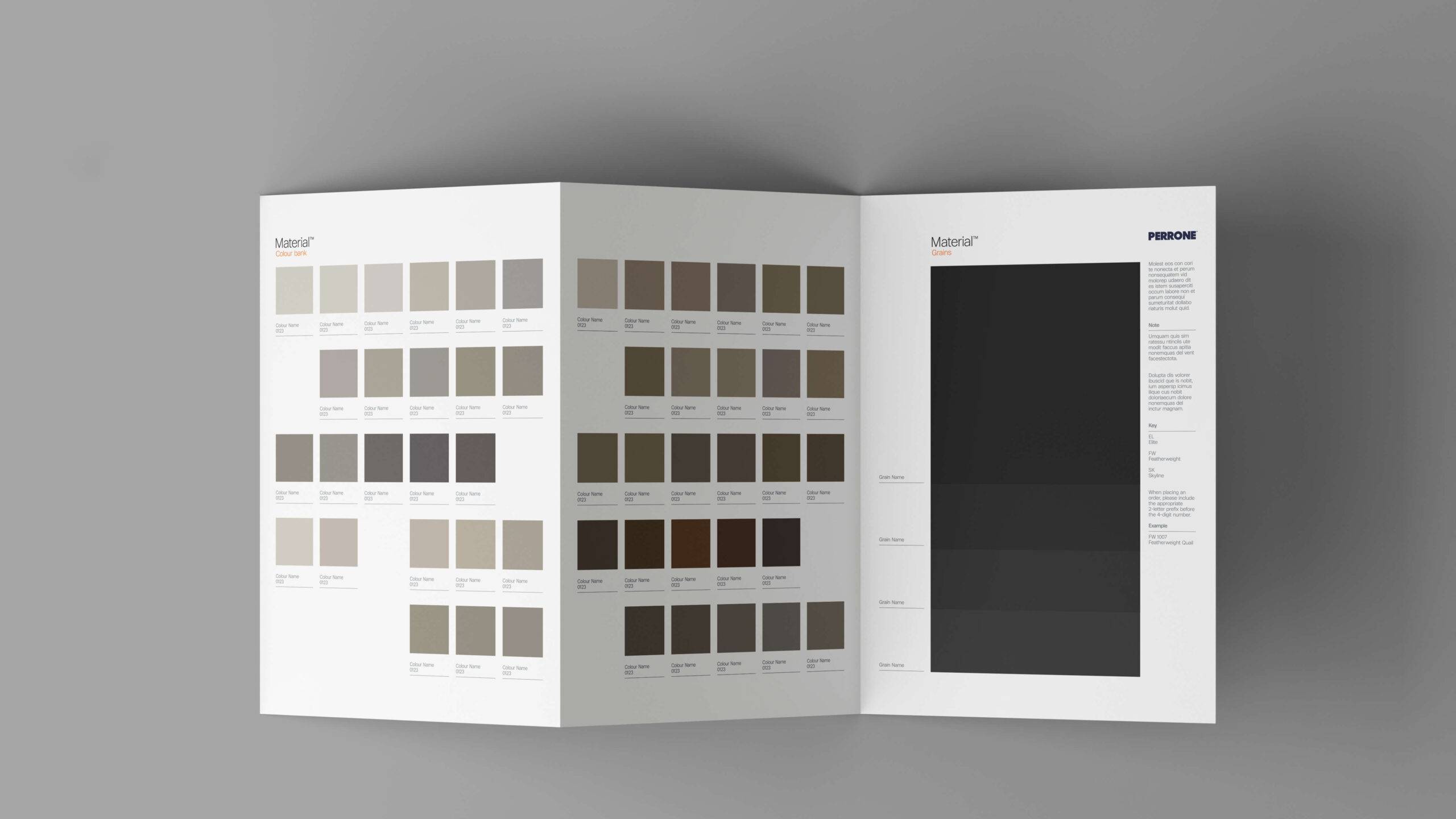
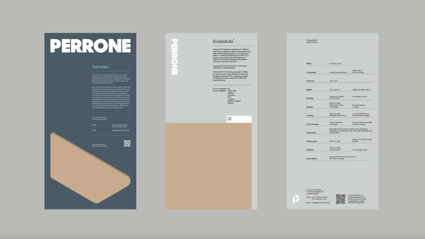
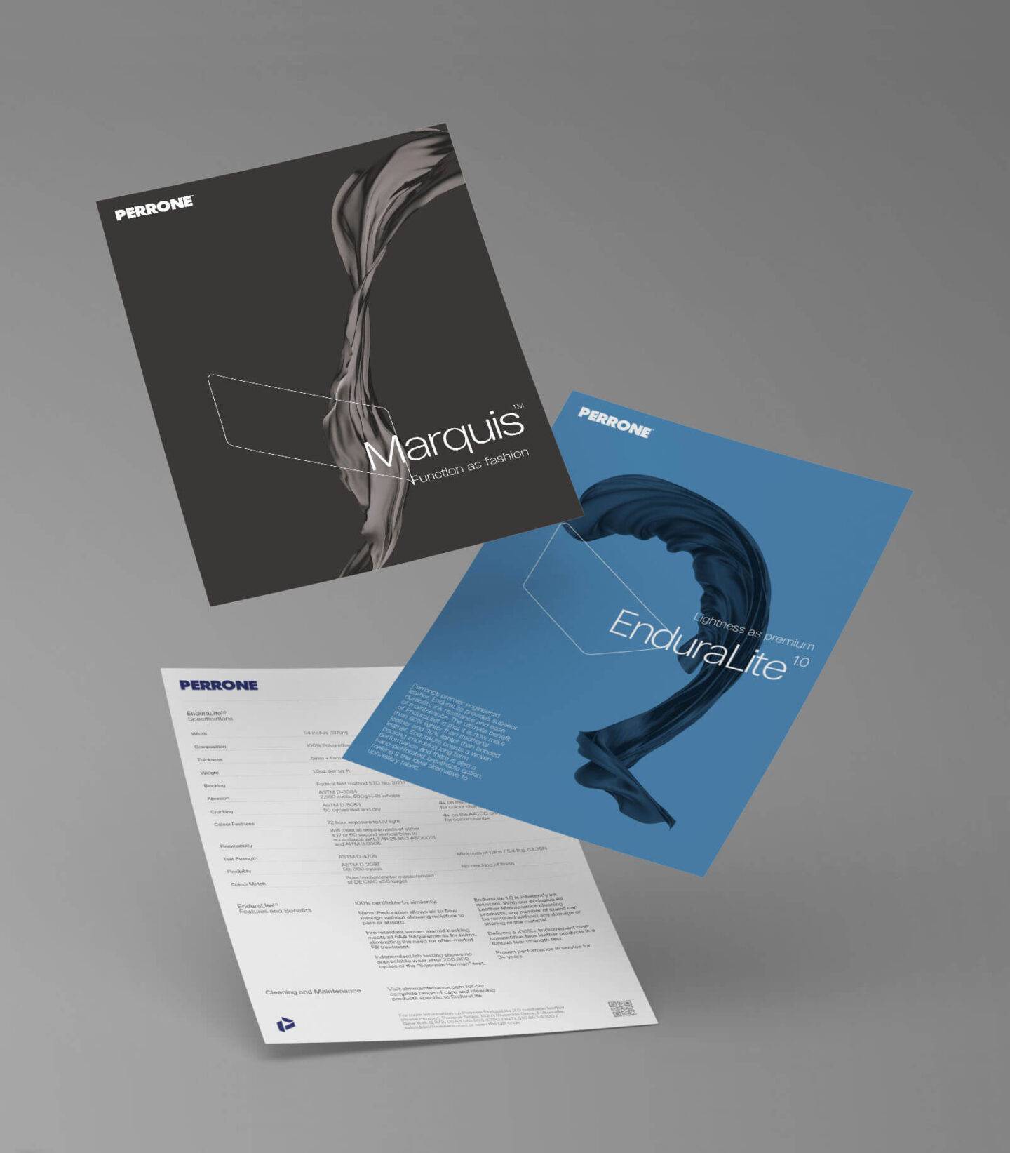
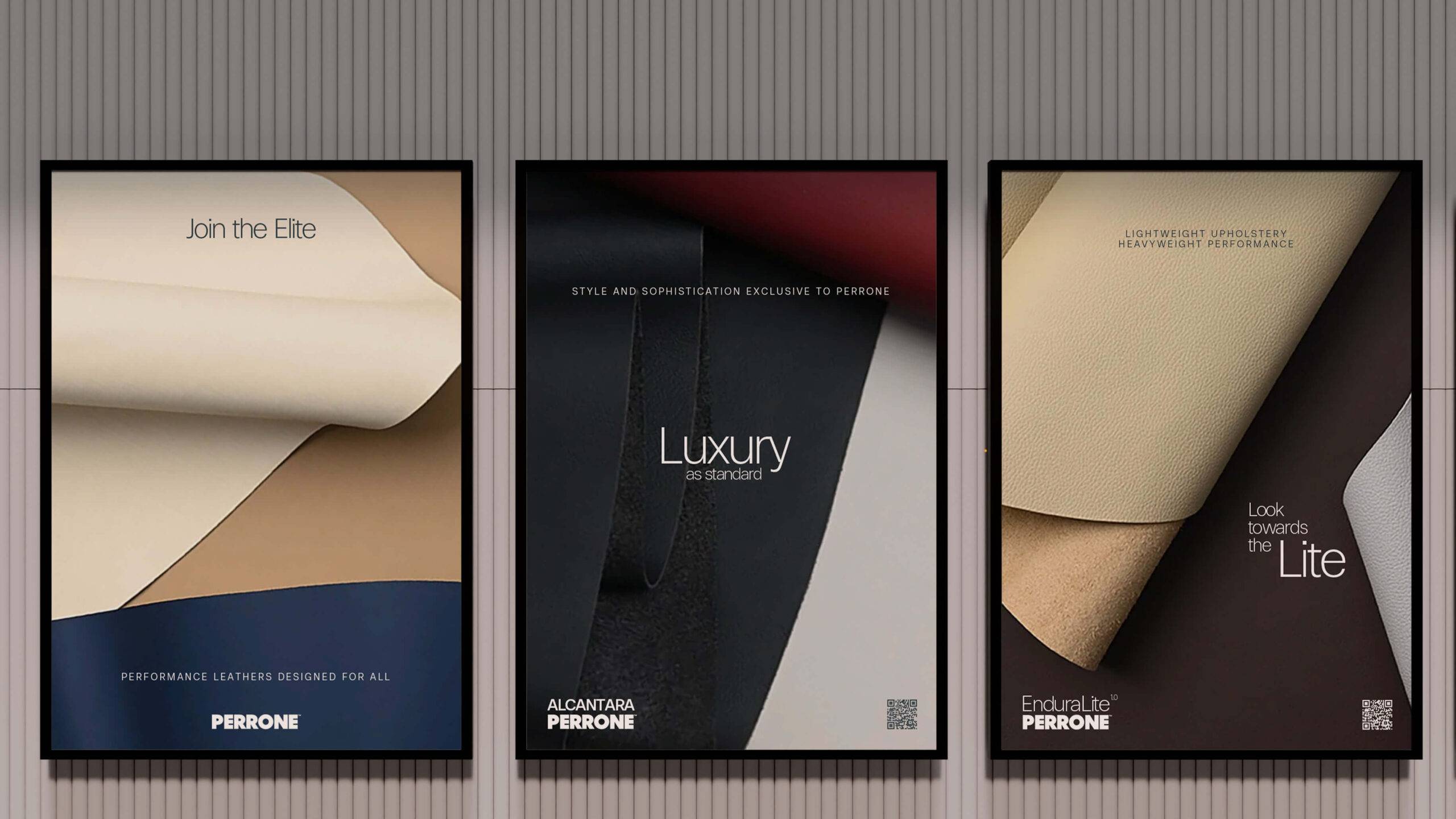
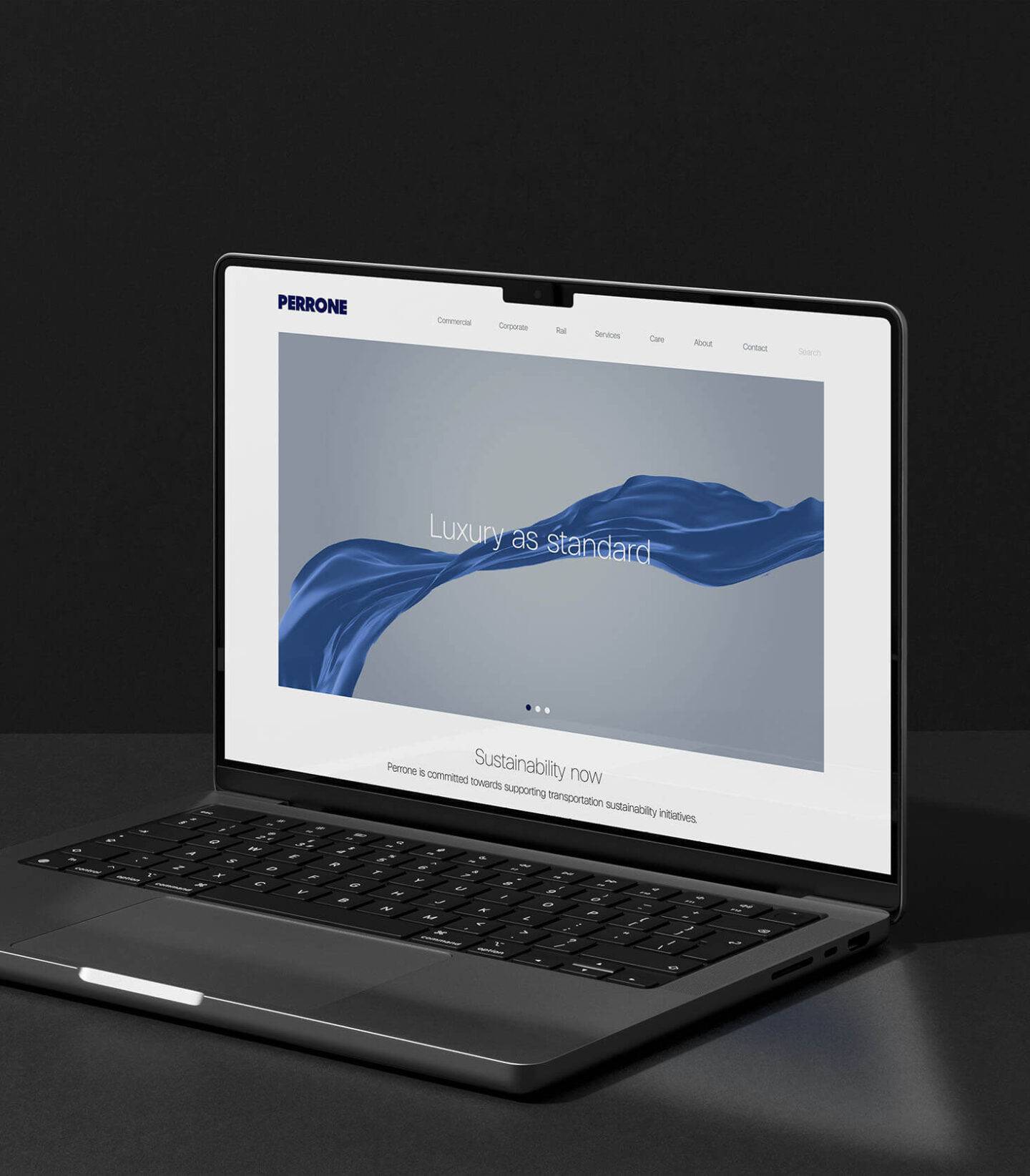
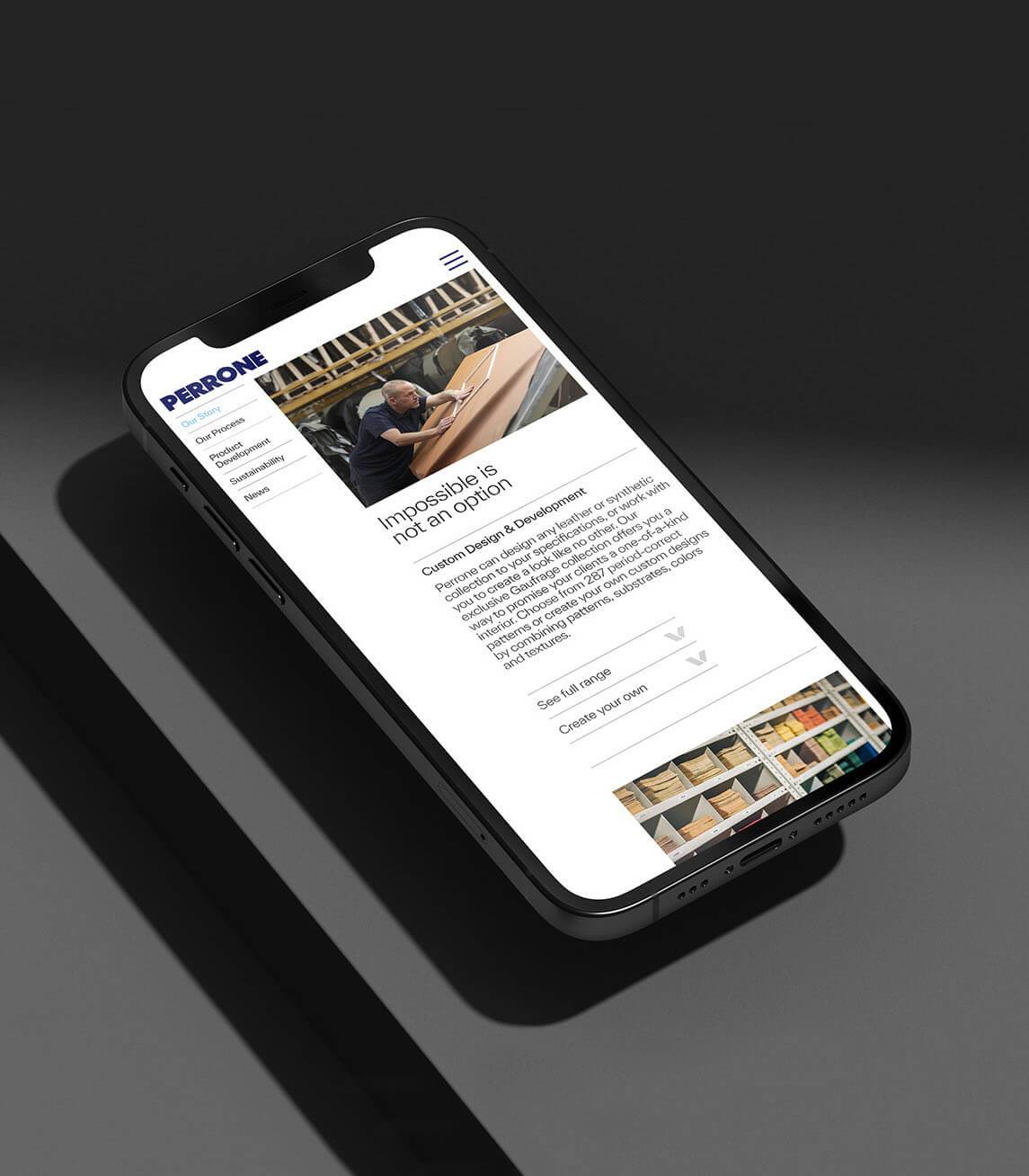
The work to define an identity that is ‘uniquely Perrone’ whilst conveying the heritage and sustainable direction of the company began with a deep review of the existing brand book. Inspiration was gathered digitally on mood boards as part of the collaborative process, and priorities were identified such as the website, material book used to showcase the product range, other promotional literature and exhibition spaces.
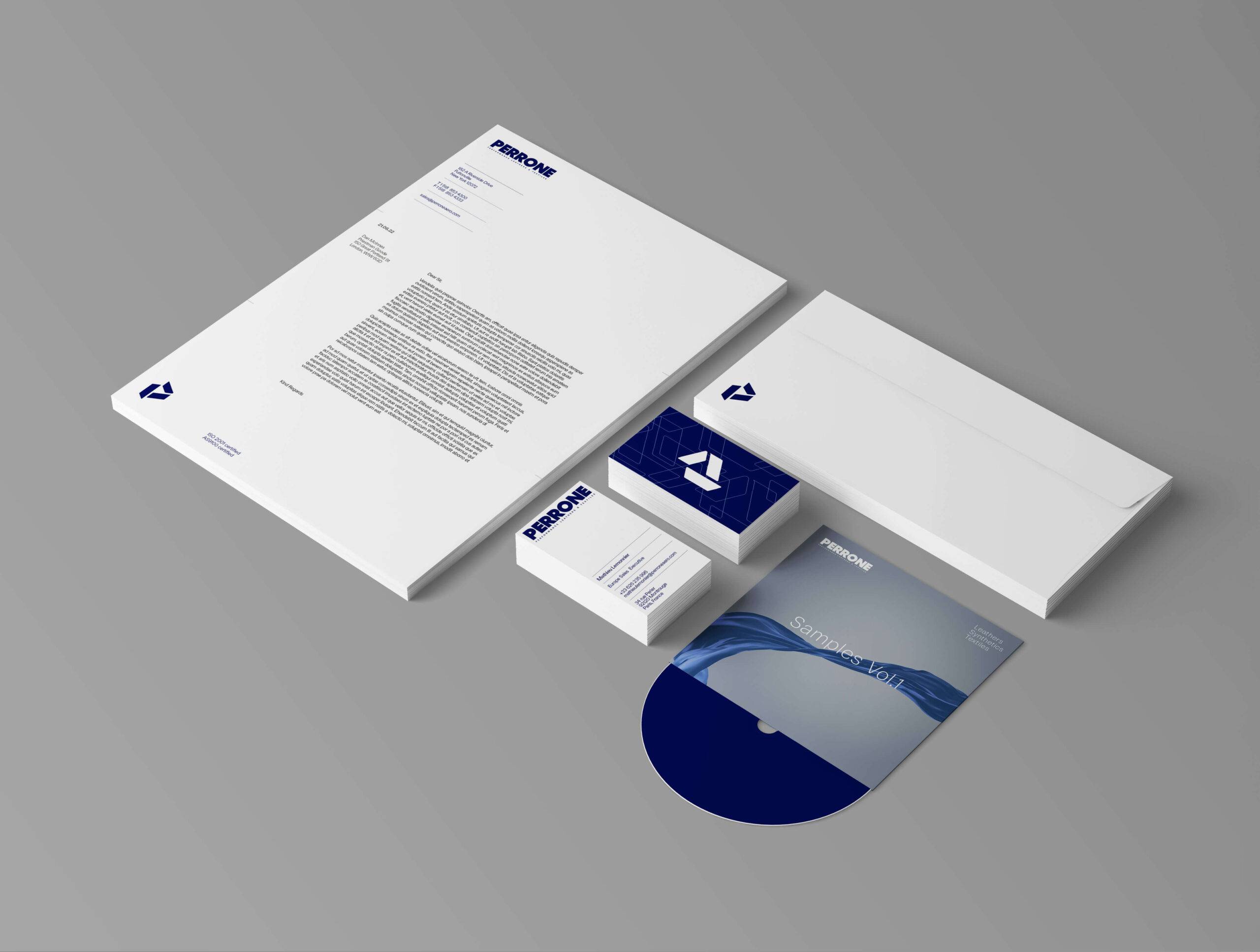
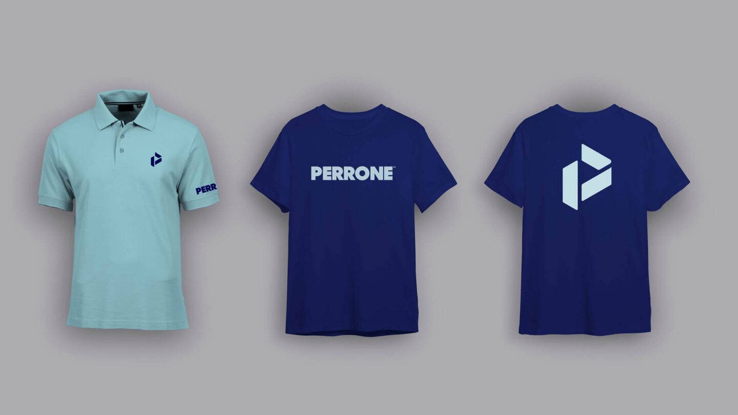
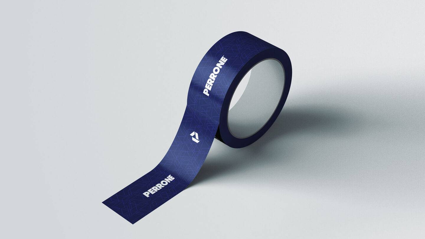
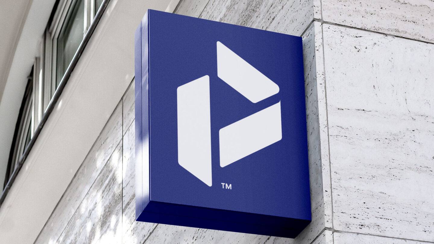
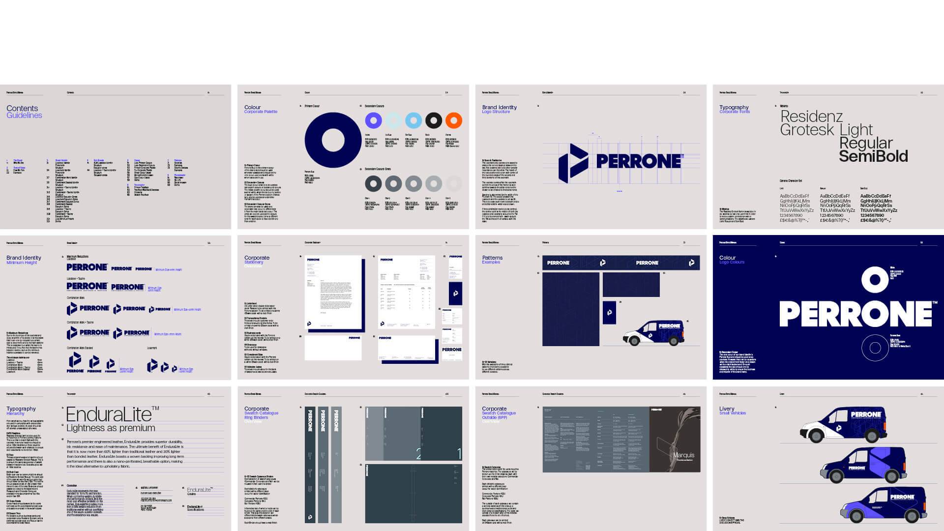
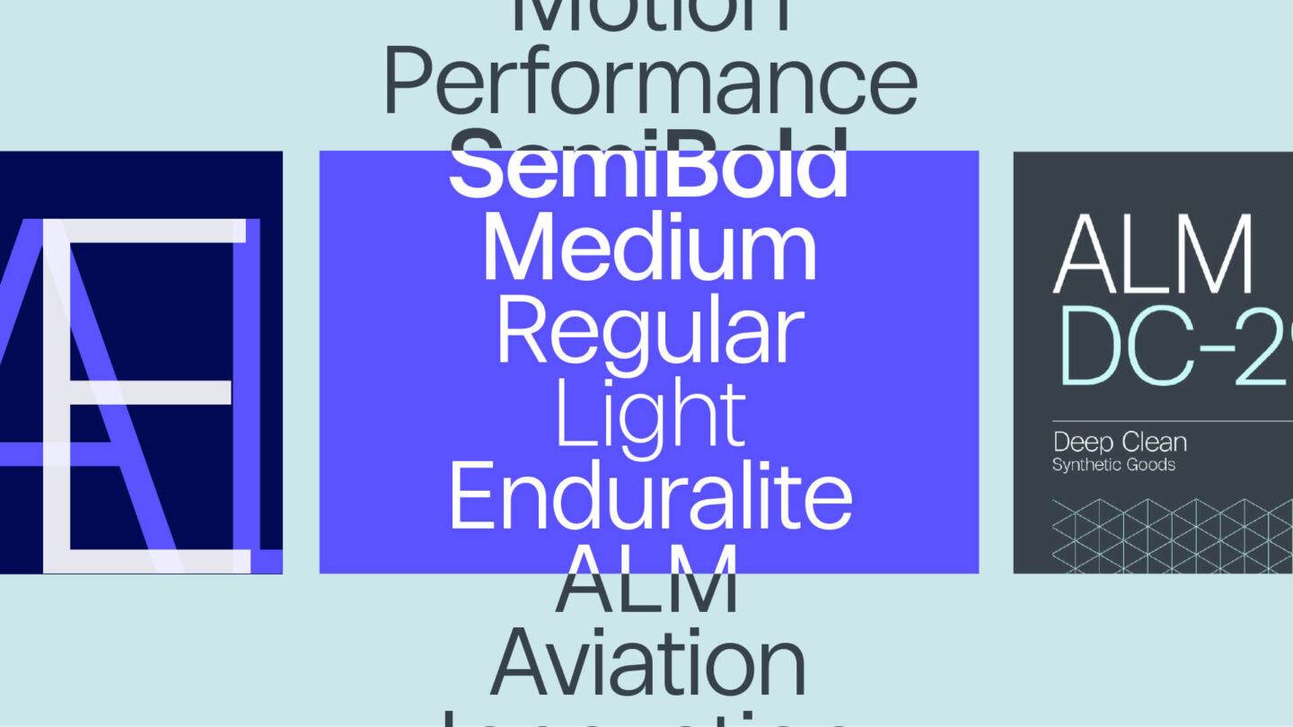
The new visual identity is a powerful tool for shaping how people perceive Perrone today and in the future. To communicate the brand’s essence and values and make it memorable in the minds of existing and prospective customers, the chosen typeface Centra No.2 conveys a bold and confident look. The three parts of the new P logomark represent different divisions of Perrone and each part also serves as a framing device in different applications of the identity. The arrow formed by the front of the P represents travel, movement and the forward thinking nature of the business. The splitting of the P into three parts also invokes the leather through various stages of the tanning process.
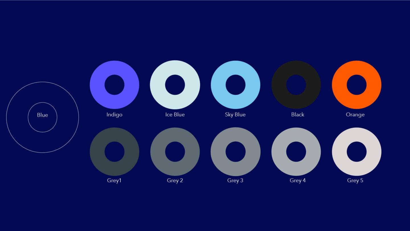
An expanded and updated colour palette, graphic language, architectural application, photography and tone of voice guidelines all feature on the Brand Book that was delivered at the conclusion of the project. These assets and other essential templates help the in-house team at Perrone and their creative partners to produce printed, physical and digital artwork as the brand moves forward to an exciting new era.